Not Every Design Problem Needs a Redesign
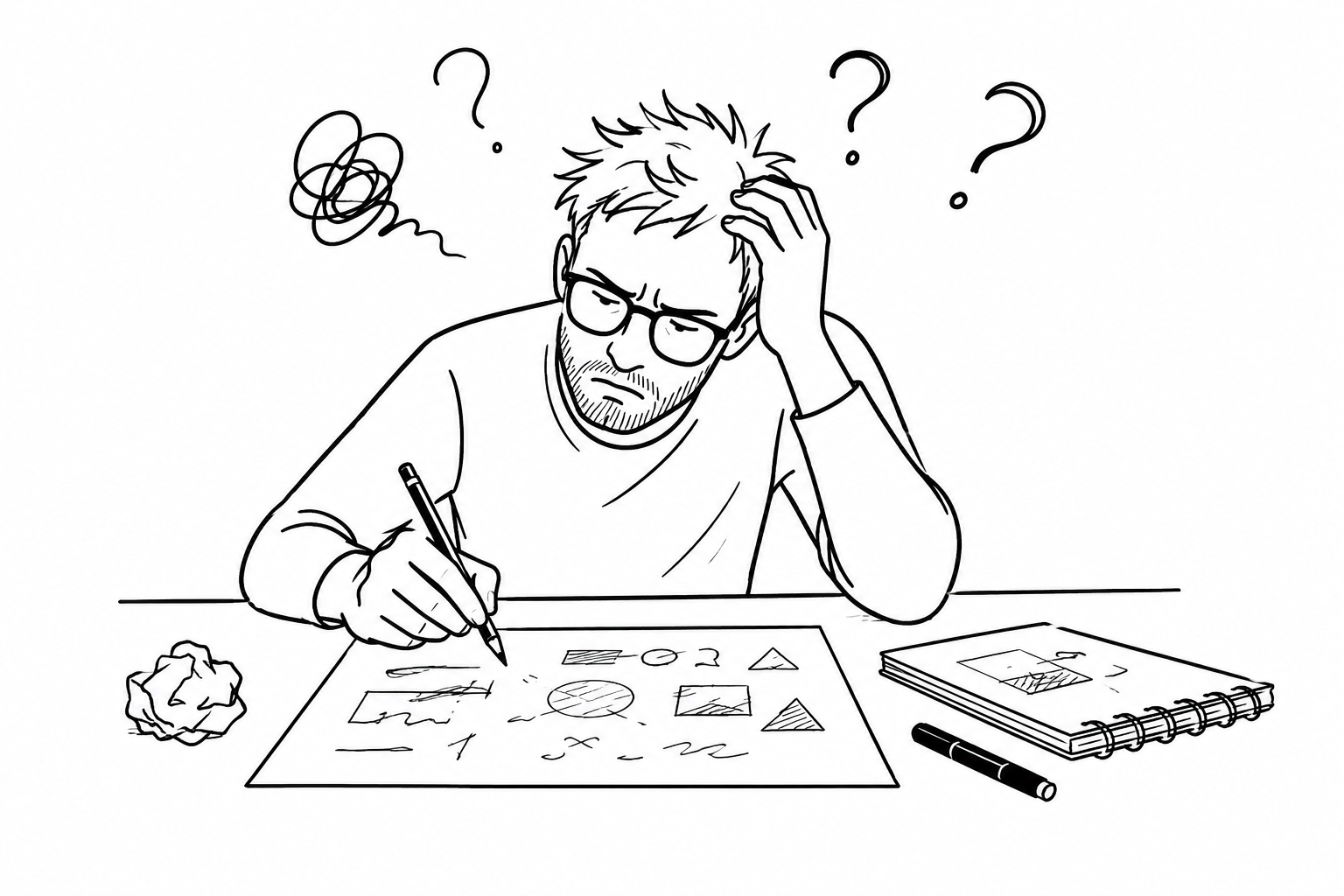
There is a particular moment that happens quite often in business. You look at your website, your brochure, your presentation or perhaps your brand as a whole, and something does not feel quite right anymore. Nothing is obviously broken. The logo still works. The colours are familiar. The photography is perfectly respectable. The information is all there. And yet, somehow, it no longer seems to represent where you are now
The first thought is often that it needs to be redesigned.
Perhaps you start looking at other websites for inspiration. You notice cleaner layouts, different typefaces, stronger photography and simpler navigation. You begin imagining what your business might look like if everything were refreshed.
There is nothing wrong with that instinct. Sometimes a redesign is exactly what is needed. But before changing anything visually, it can be useful to hold on to that feeling for a little longer.
What is it that actually feels wrong?
I have found over the years that the answer is not always the design. Sometimes the business has simply moved on while the communication has stayed behind.
A company may have started with one very clear service and one obvious type of client. Then, over time, new opportunities have appeared. More services have been added. The business has matured. The people behind it have become more experienced and perhaps more selective about the kind of work they want to do. The website grows along with all of this. A paragraph is added here. Another service is added there. A new page appears. Another sentence is squeezed into the homepage because it feels too important to leave out. Nothing happens dramatically. But eventually the simple story the business once had becomes much harder to see. Someone arriving at the website for the first time does not have the benefit of all those years of history. They do not know why one service was introduced or how one part of the business connects with another. They simply see what is in front of them. And if too much is being said at once, they may struggle to understand what matters. This is often where a redesign is expected to solve the problem.
But a new colour palette cannot decide what the business wants to be known for. A new typeface cannot decide which service should take priority. A cleaner layout cannot make six competing messages feel like one clear idea. Those decisions need to happen before the design.
I find it useful to imagine standing outside your own business for a moment. You arrive on the website knowing nothing about it. You give yourself a few seconds.
-
What do you think this business does?
-
Who do you think it is for?
-
What feels most important?
-
And perhaps most revealingly, what would you do next?
If those answers are difficult to find, the issue may be less about how the website looks and more about what it is trying to say. That is where the interesting part begins. Once the message becomes clearer, the design often settles naturally. A business might realise that three services being given equal weight are actually not equal at all. One is the heart of what they do, while the others support it. That one decision can change the whole page. The headline becomes clearer. The introduction becomes shorter. Some information moves further down. Other information disappears altogether. Nothing has necessarily been redesigned yet, but the communication already feels different. This is something I have always found interesting about visual communication. The visible design is only one part of the work. A great deal happens before that. It happens when you decide what matters, what does not, what someone needs to understand first, and what can wait. Sometimes the most useful creative decision is not adding something new. It is removing something that has been getting in the way. You may find that your website does need a complete rethink. But you may also discover that much of what you already have is perfectly good.
The photography may still work. The visual identity may still feel right. The overall structure may only need adjusting.
What has been missing is simply a clearer story.
And once that story is clearer, the visual work has something much more useful to support.
So if you find yourself thinking that your website, brand or marketing material needs refreshing, it may be worth resisting the urge to start with appearance. Spend some time asking what has changed. Think about what you want people to understand about you now, rather than what you wanted them to understand several years ago. Notice where the communication feels crowded or uncertain. You do not need to solve everything at once. Sometimes recognising the real problem is enough to make the next step much easier. Not every design problem needs a redesign.
Sometimes it needs a little clarity first.